

Under water drone company
Time Constraint- 3 Months
Designers on team- 3
Design Process
Process For this Project:
We created a design process to complete the result on time and create the best MVP for our users.
Define
Research
User Flow
Mockup
User Testing
Interaction
Analyze
Project Overview
Objection:
The design team and I had to design a drone "cockpit" ; which is basically a controller for a under water drone which has 3,000+ pre-orders
Goal:
Create/ Design a control interface that was intuitive for our audience.
Deliverables:
1.) System Map
2.) Controller Interface
3.) Icons
Check out what the Drone looks like in Action
This footage was taken on our user testing day at Monterey Bay
Research
Field Research
We needed to understand how our customers would interact with a controller when they used something similar to a video game controller. Which functions/ toggles they found easy and intuitive on the screen


Organizing Research
Categorizing Findings
After we collected all the data/findings from field research and from the questionnaires each person who pre-order a drone filled out we were able to see similarities between our users.


Personas
Narrowing Down Our User
We found that is users are in two categories beginners or experts, so for our MVP we decided to design for beginners. We believed that in the end, they would be a beginner mode and an expert mode.

Sammy
Age:
Experience Level:
Use from Drone:
Features Requested:
35
Beginner
Find places to go diving
To be able to share her dives

Jack
Age:
Experience Level:
Use from Drone:
Features Requested:
25
Intermediate
Wants to use the Drone to find places to fish
To be able to move quickly but not scare the fish
User Flow/System Map
Evolution of our System Map
Our System Map started out with a basic skeleton of features that where need for our MPV. After collaborating with the Engineers it started to grow.
Started Simple
Then grew to this

The design team and I worked with the Engineers to determine exactly the crucial features they would want.
UNDER NDA (sorry)

After lots of research and collaboration, we came up with a system map that everyone agreed on and was best for our users.
Mock-ups
Cockpit Interface Mockups
After many iterations, we were able to narrow it down to 3 different controller interfaces. From there we did user testing to see which interface was the most intuitive.


User Testing V1,V2,V3
Drone Simulator
We used a paper airplane to simulate the drone and move when the users moved the controller.


V3 Wins
V3
After much user testing, we found users found V3 most intuitive out of the 3 options.
User Testing
Coded Prototype
After V3 won the mockup user testing, we had the coders code the interface so it would actually control the drone. This allowed us to see where users were having a hard time.


What the user see's
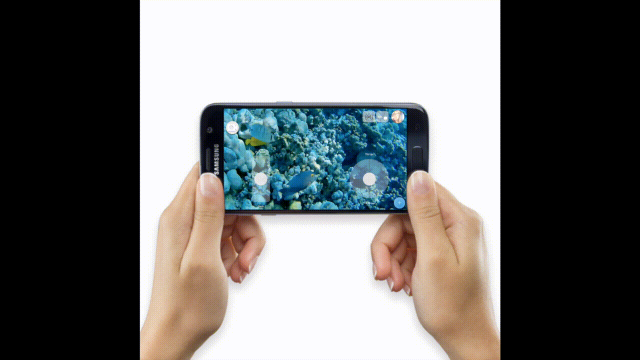
Screen Record
This video is a clip of what the user was seeing on the phone during the user testing.
High Fidelity
Micro Interactions
Adding Features
We started to add basic features that we wanted in our MPV

Record / Staring
We added a star effect so you can save your favorite moments in real-time

Hidden Menu
Hidden pop men; we didn't want to over crow the cockpit screen; we hid some of the options in a pop-menu

analyze
Next Steps
Do more user testing, and see how intuitive the interface is.
Check out another project.
